ZX80: A Display Font That Anchors Your Message From the First Scroll
It was 3:47 p.m. on launch day — and I was squinting at a YouTube thumbnail on my phone, zoomed in to 200%, trying to read the headline over a busy product mockup. The original font blurred into background noise. Too thin. Too neutral. Too… forgettable. That’s when I swapped in ZX80. Instantly, the text held its ground — crisp, dimensional, and unmistakably *there*. Not shouting. Not distracting. Just clear.
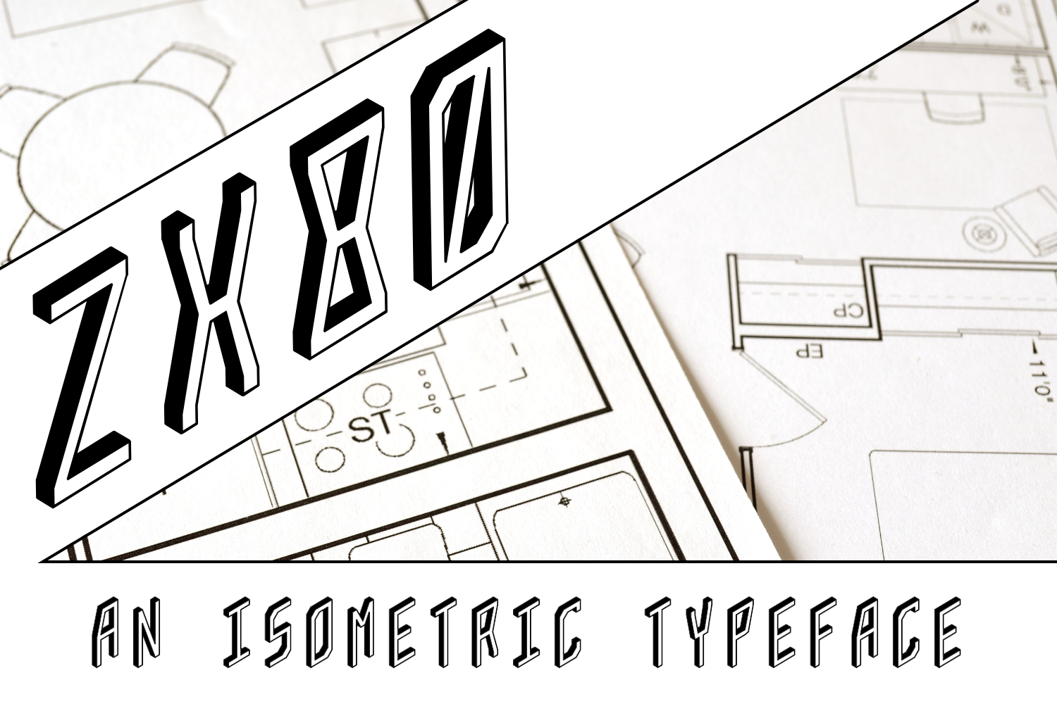
ZX80 isn’t a workhorse body font or a delicate serif for long-form blogs. It’s a display font built for moments that last less than two seconds: the split-second your audience decides whether to pause, tap, or scroll past. Its visual DNA lives in 2.5D space — think subtle bevels, clean top-down geometry, and just enough depth to suggest volume without sacrificing sharpness. It feels technical but approachable, retro-futuristic but utterly current. Not cold. Not playful. Confidently grounded.
We used ZX80 across six touchpoints for a three-week Instagram + Pinterest campaign promoting a new set of digital design templates. No big brand name, no celebrity collab — just tight creative constraints and a need for instant recognition. Here’s where ZX80 earned its place:
- YouTube thumbnails: Paired with high-contrast overlays, ZX80’s strong verticals and open counters stayed legible even at 120px height. No pixelation. No guessing.
- Instagram Reels covers: On dark gradients, its slight extrusion created natural separation from the background — no stroke needed, no drop shadow required.
- Pinterest pins: At thumbnail scale (often viewed sideways on mobile), ZX80’s balanced letter spacing and uniform x-height kept “Free Guide” and “New Kit” instantly scannable.
- Email banners: Used for short, action-driven labels like “Live Now” or “Last Chance” — never full sentences. Its presence signaled urgency without screaming.
- Landing page headers: As the sole typographic anchor above a hero image, ZX80 gave structure and weight — especially effective against textured or motion-blurred backgrounds.
- Branded content series titles: For a weekly “Design Breakdown” carousel, ZX80 became the consistent visual signature — same weight, same sizing, same rhythm across 12 posts.
ZX80 thrives where clarity > decoration. It’s not for paragraphs. Not for captions. Not for fine print. It shines in short, high-impact display roles: sale tags, webinar titles, course module labels, shop banner headlines, promo stickers, and logo-style wordmarks. Think “Summer Edit”, “Beta Access”, “Workshop Starts”, or “Limited Run”. Anything under five words — especially with a strong first letter (Z, X, 8, or 0) — gets an instant boost from ZX80’s architectural presence.
Readability on small screens? It’s built for it. The uppercase-heavy character set avoids lowercase ambiguity at tiny sizes. Letterforms are generously spaced, with generous counters (the enclosed spaces in ‘a’, ‘e’, ‘o’) that resist filling in on low-res previews. On dark backgrounds, it pops cleanly — no halo effect. On light ones, it holds contrast without harsh edges. And crucially: it doesn’t compete with imagery. It sits *with* your visuals, not over them.
Pairing ZX80 is intuitive, not intimidating. We consistently paired it with a clean, neutral sans serif — think Inter, Manrope, or our in-house system font — for body copy, captions, and UI labels. The contrast works because ZX80 brings dimension; the sans brings breath. For more editorial moments (like quote graphics or newsletter headers), we layered it over a warm, low-contrast serif — something like Literata or PT Serif — letting ZX80 carry the headline while the serif handled nuance below. Avoid pairing with other display fonts or heavy scripts — ZX80’s voice is distinct enough to stand alone.
Before locking it into final assets, we double-checked what came in the package: four weights (Light, Regular, Bold, Black), true italics (not skewed), OpenType features including stylistic alternates for ‘A’, ‘R’, and ‘G’, and basic Latin-1 multilingual support — enough for English, Spanish, French, German, and Portuguese campaigns. All files were .woff2 and .ttf, licensed for commercial use across digital ads, client decks, Shopify banners, and downloadable PDFs. No surprises. No last-minute font swaps.
One thing we didn’t do? Force it everywhere. ZX80 earns attention — so we reserved it for moments that truly needed it. A sale announcement? Yes. A subtle footer credit? No. A product description paragraph? Absolutely not. Its power lies in restraint. When every campaign element fights for dominance, ZX80 doesn’t shout — it anchors.
It also quietly reinforced consistency. Because the font behaves predictably across platforms — same weight rendering on iOS and Android, same line height in Figma and Canva, same spacing in email clients and landing page builders — our team spent less time adjusting kerning and more time refining messaging. That consistency translated directly into how the campaign felt: cohesive, intentional, and visually trustworthy.
If you’re building a campaign where first impressions happen in milliseconds — on feeds, in tabs, in notifications — ZX80 isn’t just another font. It’s a visibility tool. A clarity amplifier. A quiet piece of design infrastructure that makes your message land before your audience finishes loading the page.
So next time you’re staring at a thumbnail, tweaking a banner, or prepping a launch graphic — ask yourself: does this text *hold space*, or does it fade? With ZX80, you don’t hope it reads. You know it will.