Dot: A Pixel Display Font for Creative Web Design
I had a boutique skincare brand landing page open in Figma, and the hero section felt flat. The photography was beautiful, the layout clean, but the headline typography needed something unexpected. I had already cycled through a handful of sans serif fonts and a few display fonts that felt too heavy. Then I dropped Dot into the header, nudged the tracking up a touch, and the whole composition shifted. What was a safe, polite layout suddenly had personality, texture, and a quiet futuristic edge that still felt approachable.
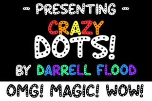
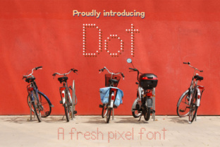
Dot is a tiny pixel font built from precise dotted letters. It carries a fresh, technical charm that reads like a nod to early digital displays without feeling retro or dated. The dots are evenly spaced, the letterforms are clean, and the overall mood sits somewhere between modern brand identity work and playful editorial design. For web designers and digital product creators, this is a display font that opens up creative possibilities without demanding the entire layout revolve around it.
What Dot Brings to a Digital Layout
The first thing I noticed when testing Dot on a live preview was how naturally it draws the eye. The dotted construction creates a broken-line effect that feels textural even on a flat screen. On a light background, the tiny gaps in each letterform soften the contrast, giving headlines an airy, almost perforated quality. On a dark background, the dots glow with a subtle tech-forward energy that works beautifully for web design projects in the creative, wellness, or lifestyle space.
This creative font has a personality that lands somewhere between a stencil and a pixel grid, but it never feels harsh. The rounded dot terminals keep it friendly, and the consistent rhythm across the character set makes it predictable to work with, which matters when you are building a reusable design system for a client site or a digital brand kit. I tested it on a coaching website header, a product landing page, and a portfolio homepage, and each time it held its own without competing with the surrounding imagery.
Where Dot Shines in Web Projects
Dot is not a workhorse typeface for body copy, and it does not pretend to be. It is a premium font built for short, intentional moments. Here are the places where it performed best during testing:
- Hero section titles — Dot turns a three-word headline into a visual statement. On a boutique online store, a hero title like "Small Batch Care" set in Dot felt handcrafted and deliberate.
- Section dividers and decorative labels — Small eyebrow headings or category labels on a course sales page gained personality without distracting from the main navigation flow.
- Logo text and brand marks — For a creative portfolio or a digital product shop, Dot works as a logotype that communicates modern individuality.
- Button text and micro-interactions — On larger buttons, Dot adds a tactile, almost stitched quality that invites clicking. I used it on a "Reserve Your Spot" button for a campaign landing page, and the dotted letters felt like tiny perforations waiting to be broken.
- Blog graphics and social media graphics — As an overlay on images, Dot creates a layered, editorial feel that pairs well with minimalist photography.
Readability and Responsive Behavior
I tested Dot across three breakpoints on a staging site, and the results were consistent. At larger sizes, above 40 pixels, the dotted structure reads clearly and the letter spacing feels intentional. At mid-range sizes, around 24 to 32 pixels, it still holds up for section labels and short headings. Below 18 pixels, the dots begin to merge visually on standard screens, and the letterforms lose their definition. For mobile hero text, I recommend setting Dot at a generous size and keeping the phrase short. A two-word headline on a mobile viewport can look stunning, while a full sentence will feel cramped and lose its charm.
On image overlays, Dot needs a bit of care. I placed it over a lifestyle photo with a semi-transparent dark overlay, and the dotted letters popped beautifully. On a busier background without a buffer, the dots can get lost in the visual noise. A simple solution is adding a subtle text shadow or using a slightly tinted backdrop behind the text block. This keeps the creative font legible without muting its character.
Font Pairing for a Cohesive Digital Identity
Pairing Dot with a clean sans serif font is the most natural path for web work. I matched it with a neutral geometric sans for body copy on a coaching website, and the contrast between the dotted display text and the smooth body paragraphs created a balanced visual hierarchy. The sans serif did the heavy lifting for readability, while Dot added texture and voice to the headlines.
For projects with a more editorial tone, a serif font pairing can work surprisingly well. I tried Dot alongside a classic transitional serif on a blog redesign concept, and the playful dotted headlines against the elegant body text gave the layout a layered, magazine-like quality. A handwritten font or script font pairing can also work for a boutique feel, but I would limit that combination to a single hero section rather than repeating it throughout the site. Too many decorative elements dilute the impact of the display font and can make the brand identity feel scattered.
Practical Considerations for Web Designers
Before adding Dot to a client project or a personal digital product, there are a few practical points worth checking. First, confirm the commercial font licensing covers web use. Many design assets come with desktop licenses by default, and web embedding often requires an extended license or a separate webfont file. Check for WOFF and WOFF2 formats if self-hosting, or confirm availability through a font delivery service if the project relies on cloud-hosted fonts.
Also, review the included character set. If the site serves a multilingual audience, verify that accented characters, special glyphs, and any alternate styles are present in the file. I tested a few European language characters during my review, and Dot handled them cleanly, but always double-check the multilingual support specifics against your project needs.
One thing to keep in mind is that Dot is not suitable for long-form text, form labels, navigation menus, or any interface element that requires quick scanning. The dotted construction, while charming, slows down reading speed. For accessibility-conscious projects, reserve Dot for decorative headings and ensure all critical information is delivered in a readable sans serif font or serif font that meets contrast and legibility standards. This is not a limitation of the font itself, it is simply the reality of working with a display font in a digital environment.
Dot as a Branding Tool for Digital Products
For digital product creators, course designers, and online shop owners, Dot offers a quick way to inject personality into a brand identity without a full redesign. I used it on a digital template preview for a Notion planner shop, and the dotted headers gave the product images a handmade, tactile quality that stood out in a sea of minimalist mockups. On a product landing page for a digital download, a single dotted headline created a focal point that felt intentional and on-brand.
The modern typography landscape is saturated with clean sans serifs and flowing scripts, but a dotted pixel font like Dot occupies a niche that feels fresh and underused. It works for logo design explorations, packaging design mockups presented on a portfolio site, and any digital project where the goal is to signal creativity without shouting. I can see it thriving on a web design project for a creative studio, a children's brand, a tech-forward wellness company, or an indie game landing page.
What I appreciate most after testing Dot across multiple layouts is its restraint. It does not demand attention through size or weight. It earns it through texture, rhythm, and a quiet confidence that makes a simple headline feel like a design choice rather than a placeholder. For web designers and digital creators who want a creative font that adds personality without overwhelming the user experience, Dot is a small but mighty addition to any design assets collection.